
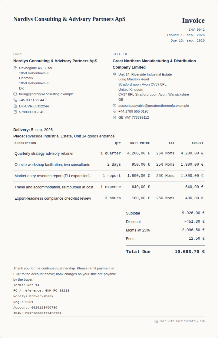
Balanced default
Essential
A clean, quiet layout that works with or without a logo and keeps the document easy to scan.
Good for: everyday invoicingWatch the same invoice move through all eight InvoiceCraftly design styles. The information stays put; only the visual hierarchy, density, and branding treatment change.
The video uses one fictional invoice throughout so the layout—not the content—is the only variable.
Eight invoice designs. Same data. Start with Essential: clear, quiet, and easy to scan. Switch to Modern for a stronger branded header. Studio gives the logo and business identity more room.
Trades puts hours, units, and rates at the centre of the document. Compact keeps long line-item lists dense and readable. Professional follows a familiar B2B structure. Corporate separates seller, buyer, and VAT information explicitly. Nordic uses restrained typography and generous whitespace.
Only the design changes. Your invoice content stays the same, and you can switch again at any time. Choose a style, review the preview, and export from InvoiceCraftly.
Start with the reading job your customer has to do. You can change your mind in the editor without re-entering the invoice.
A clean, quiet layout that works with or without a logo and keeps the document easy to scan.
Good for: everyday invoicing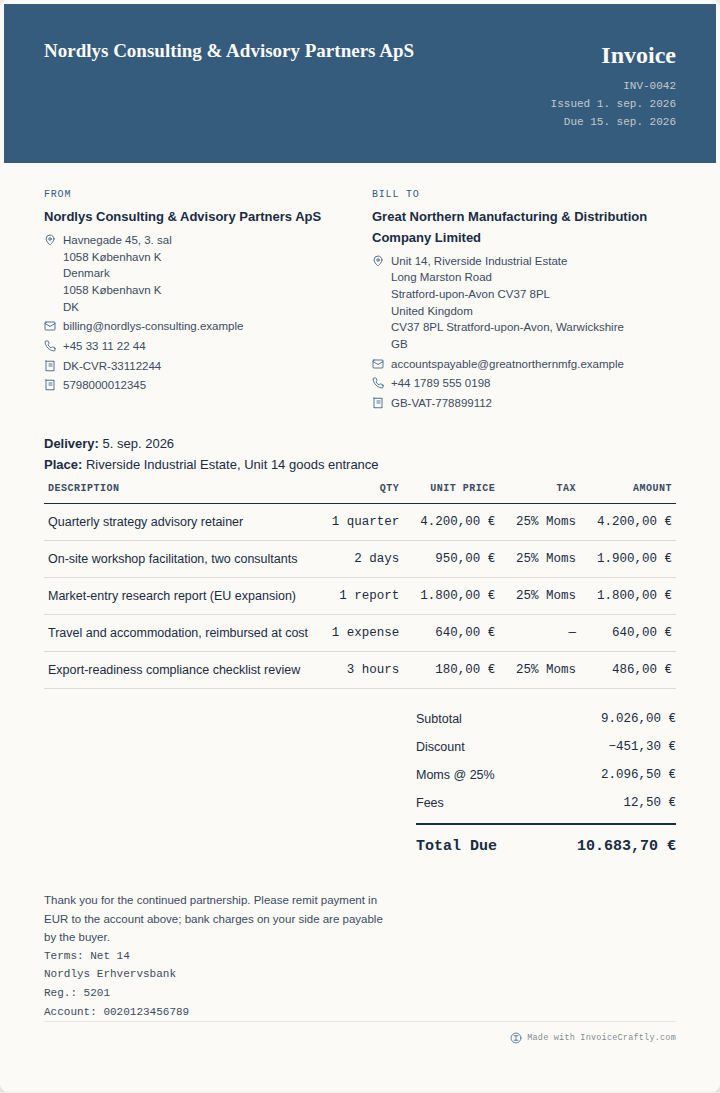
A bolder branded header gives digital-first businesses a more expressive presentation.
Good for: agencies and online services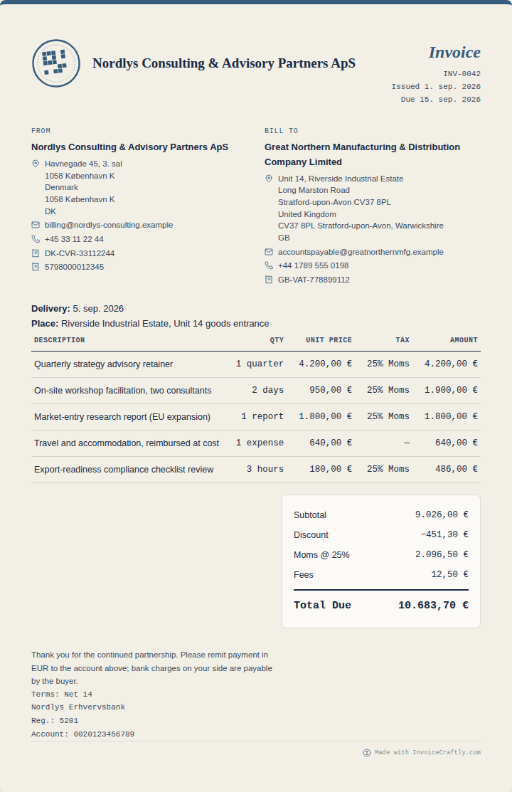
More room for a logo and business identity, while the financial information remains clear.
Good for: photographers and designers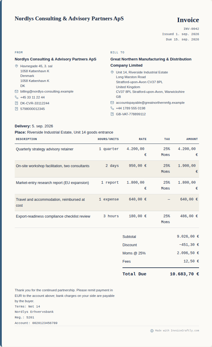
Hours, units, quantities, and rates are presented for quick review of hands-on work.
Good for: contractors and trades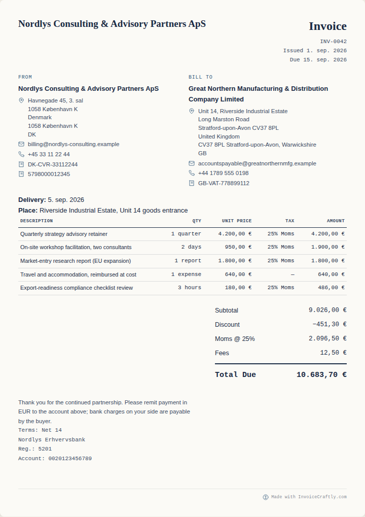
A denser layout keeps invoices with many line items readable without unnecessary visual weight.
Good for: detailed itemised invoices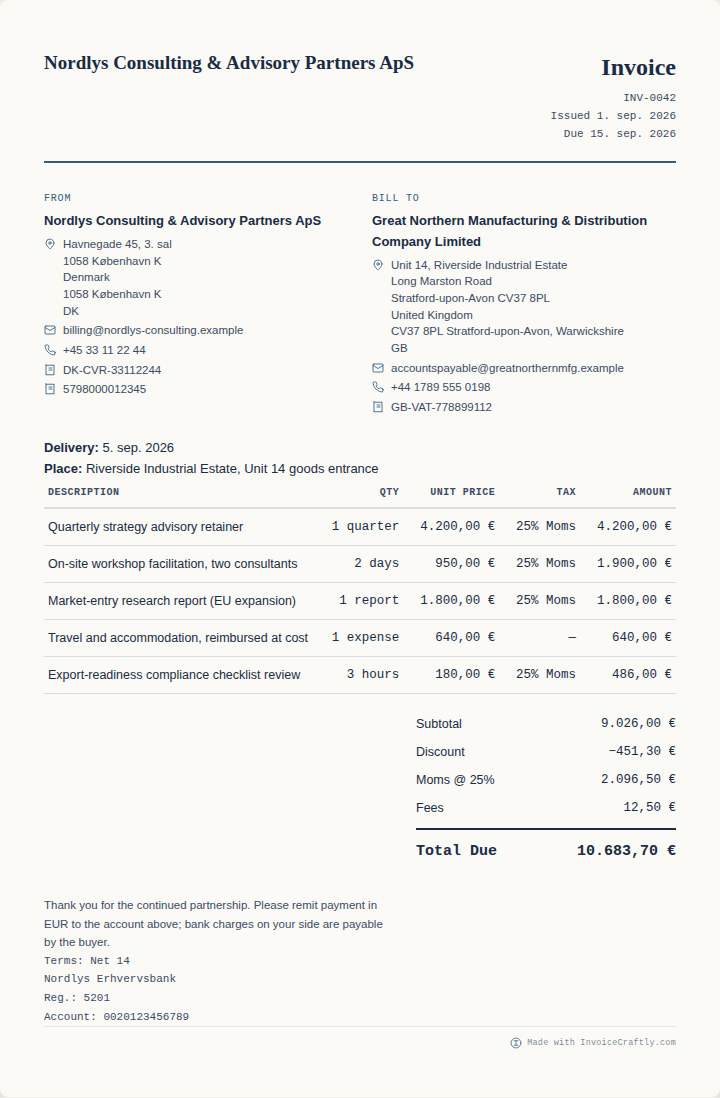
A conventional B2B hierarchy makes the parties, reference details, and amount easy to approve.
Good for: consultants and B2B services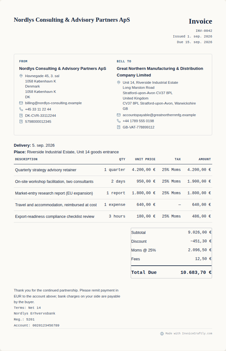
Seller, buyer, and VAT information are separated clearly for formal business workflows.
Good for: structured company billing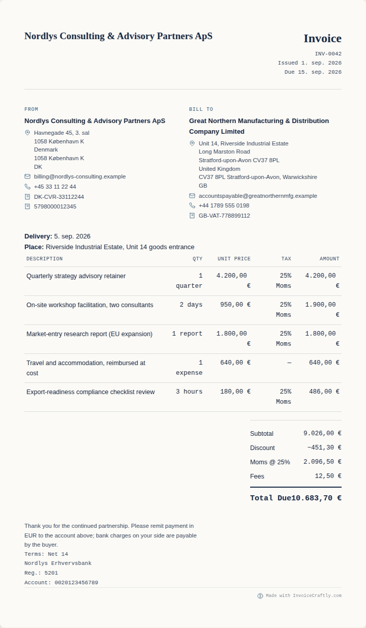
Generous whitespace and disciplined typography create a calm, direct reading experience.
Good for: minimal brands and servicesA design style controls how the invoice is composed visually. It does not rewrite the business record beneath it.
| If you need… | Start with | Why |
|---|---|---|
| A flexible everyday invoice | Essential | Neutral hierarchy that suits a wide range of work. |
| A more visible brand | Modern or Studio | More emphasis on colour, logo, and identity. |
| Hours, units, and rates | Trades | The work breakdown carries more visual weight. |
| Many line items | Compact | Higher density without hiding the totals. |
| A familiar approval format | Professional | Conventional B2B structure supports quick review. |
| Formal party and VAT detail | Corporate | Business identities and reference information are explicit. |
| A minimal, spacious document | Nordic | Restrained typography and whitespace lead the page. |
Yes. Design selection is separate from invoice content, so you can compare layouts in the live preview without entering the document again.
No. A design changes visual presentation, not the quantities, rates, discounts, tax, totals, or payment details in the invoice.
Compact is the clearest starting point when you have many line items. Always review page breaks and the final export before sending.
Yes. Your logo and brand colour remain document controls. Studio and Modern give branding more visual emphasis, while Essential and Nordic are more restrained.
They are design styles, not separate copies of your content. Profession templates can provide starting data, while the design controls how that data is presented.
Open the editor, add your details once, and switch until the document feels right.